
Theme Options
This settings page controls the appearance of the entire site, organized into tabs: Layout, Design, Loading Style, Fixed Widget, Page Title, Sidebar, Plugins, and Custom.
The relationship between Theme Options and Page Options
What you set here are the site-wide defaults. If a particular page needs a different style, you can override it individually in that page's Page Options.
Cache reminder
After saving settings, the page may not refresh the effect immediately due to browser caching. Press Ctrl + F5 to force a refresh.
Layout
Layout Settings
Choose the layouts for the site's three major areas — Header, Content, and Footer. These layouts can also be created in PageBuilder > Layout:
| Setting | Description |
|---|---|
| Header Layout | The site's Header layout; can also be created in PageBuilder > Layout > Header Layout |
| Content Layouts | The site's Content layout; can also be created in PageBuilder > Layout > Content Layout |
| Footer Layouts | The site's Footer layout; can also be created in PageBuilder > Layout > Footer Layout |
Design
Container Settings
| Setting | Description |
|---|---|
| Container Layout | The display mode of the theme: Wide or Boxed |
When Boxed is selected, the following settings take effect:
| Setting | Description |
|---|---|
| Boxed Shadow | Whether to display a shadow for the container |
| Boxed Background Color | The background color of the container |
| Boxed Background Image | The background image of the container |
| Boxed Spacing (Top / Right / Bottom / Left) | The four-sided outer margin of the container |
Width and spacing (responsive; can be set per resolution):
| Setting | Description |
|---|---|
| Column Gap | The spacing between columns |
| Container Width | The width of the content area |
| Section Top Spacing | The top spacing of the Section |
| Section Bottom Spacing | The bottom spacing of the Section |
Body Background
The background color or background image of the entire page; after setting an image you can also adjust attachment (scroll/fixed), position, repeat, and size.
Content Style
About CSS classes
Some of the settings below are annotated with the corresponding CSS class name (such as color-accent); you can reference the corresponding variable by that class name in custom CSS.
| Setting | Description |
|---|---|
| Default Font Color | The default text color (class: default-color) |
| Accent Color / Accent Color 2 / 3 / 4 | 4 sets of accent colors (class: color-accent ~ color-accent4) |
| Link Color / Visited / Hover / Active Link Color | The default, visited, hover, and active colors of links |
| Default Font Family | The default font family (class: default-family) |
| Font Family 2 | The second font family (class: family2) |
| Default Font Size | The default font size (class: default-size) |
| Default Line height | The default line height (class: default-lineheight) |
| Letter-spacing | The letter spacing |
| Strong Style | The font weight of bold text (<strong>) |
Button Color
Provides 5 sets of button colors, each with a primary color and a hover color:
| Setting | Description |
|---|---|
| Color 1 ~ Color 5 | The primary colors of the 5 button sets |
| Hover Color 1 ~ Hover Color 5 | The hover colors of the corresponding buttons |
H1 - H6 Style
Each of H1 ~ H6 is set independently, with each level containing:
| Setting | Description |
|---|---|
| Hn Color | The color of that heading level |
| Font Family | The font family (Inherit can be selected to inherit the default) |
| Font Weight | The font weight |
| Font Size | The font size (responsive) |
| Line Height | The line height (responsive) |
| Letter-spacing | The letter spacing |
Loading Style
The loading animation displayed while the page is loading.
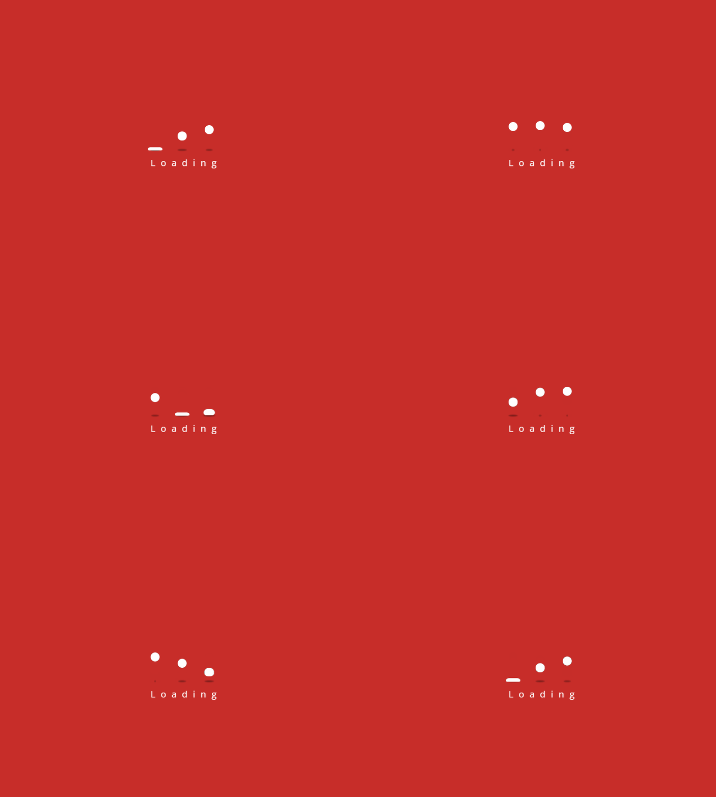
| Setting | Description |
|---|---|
| Enabled | Whether to enable the loading animation |
| Background Color | The background color of the loading animation |
| Color | The color of the loading spinner |
Fixed Widget
The fixed widget is displayed in the bottom-right corner of the page.
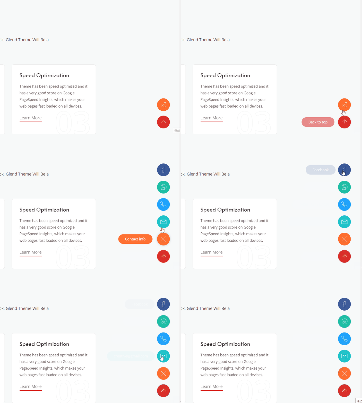
Widget Type — Choose the form of the widget:
- Social Icon — Displays a set of social media icons
- Back to top — Displays a back-to-top button
Social Icon Mode
| Setting | Description |
|---|---|
| Enabled Fixed Widget | Whether to display the widget |
Check the social media you want to display; each item can be set with display text and a link URL:
- Social links: Behance / Dribbble / Twitter / YouTube / Instagram / Vimeo / Pinterest / Linkedin / RSS / Facebook / WhatsApp
- Phone (the link is
tel:) - Envelope (email; the link is
mailto:) - Share (you can set the icon color and text)
| Setting | Description |
|---|---|
| Open New Window | Whether links open in a new window |
| BackTop | Whether to also display a back-to-top icon |
| BackTop Text | The hover text of the back-to-top icon |
Back to top Mode
| Setting | Description |
|---|---|
| Enabled Back to top | Whether to display the back-to-top button |
| Color | The color of the button |
Page Title
| Setting | Description |
|---|---|
| Page Title Enabled | Whether to enable the page title |
| Page Title Layout | The layout form: Horizontal or Vertical (title and breadcrumb on two lines) |
| Height | Custom (a custom value) or Full Height (same height as the browser window) |
| Display Arrow | Whether to display a down arrow; clicking it scrolls the page to the content area |

| Setting | Description |
|---|---|
| Display Bottom Line | Whether to display a divider line at the bottom of the page title area |
| Display Breadcrumbs | Whether to display the breadcrumbs |
| Scrolling Text Animation | Whether to display the scrolling text animation when the page scrolls |
| Background Color | The background color of the page title area |
| Display Title Line | Whether to display the title decorative line |
After enabling Display Title Line, you can set the gradient start and end colors of the decorative line:
| Setting | Description |
|---|---|
| Title Line Color Start | The start color of the title line |
| Title Line Color End | The end color of the title line |
| Setting | Description |
|---|---|
| Background Image | The background image of the page title area (attachment / position / repeat / size can be set) |
| Color Overlay | The overlay mode: OFF / Light / Dark |
| Overlay Opacity | The opacity of the overlay (10% ~ 90%, effective when the overlay is enabled) |
| Font Color | Light or Dark |
| Font Size | Large / Medium / Small |
| Background Region | The display range of the background; whether to include the Header area (PageTitle And Header) |
Breadcrumbs
| Setting | Description |
|---|---|
| Display Breadcrumbs | Whether to display the breadcrumb area |
| Location | Outside (outside the page title) or Inside (inside) |
| Text Align | Left / Center / Right |
| Layout | Boxed or Wide |
| Background Color | The background color of the breadcrumb area |
| Spacing | The top, right, bottom, and left spacing of the breadcrumb text |
| Display Border Line | Whether to display a border line for the breadcrumb area |
After enabling Display Border Line, you can set the width, style (Solid / Dashed / Double, etc.), and color of the top and bottom borders separately.
Breadcrumbs Style — 3 styles are available:
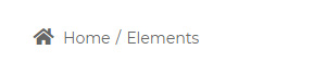
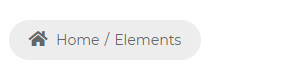
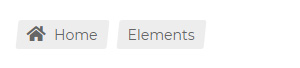
| Setting | Description |
|---|---|
| Breadcrumbs Background Color | The breadcrumb background color (effective for styles 2 and 3) |
| Breadcrumbs Accent Color | The breadcrumb accent color (Inherit or Custom can be selected) |
| Breadcrumbs Color | The text color of the breadcrumbs |
| Breadcrumbs Font Size | The text size of the breadcrumbs |
| Breadcrumbs Line Height | The line height of the breadcrumb text |
| Custom Home Text | The text of the breadcrumb home (Home by default) |
Sidebar
| Setting | Description |
|---|---|
| Enabled | Whether to enable the sidebar |
| Sidebar Position | Left or Right |
| Sidebar Width | The width of the sidebar (px) |
| The width of the sidebar in the tablet | The sidebar width on tablets: Same as desktop / Full width / Custom |
| The position of the sidebar in the mobile | The sidebar position on mobile: Auto / Before the content / After the content |
| Fixed Sidebar | Whether to enable the fixed feature. When enabled, the sidebar stays fixed as the content scrolls |
| Sidebar Spacing | The top, right, bottom, and left spacing of the sidebar |
Sidebar Menu
| Setting | Description |
|---|---|
| Display Sidebar Menu | Whether to enable the sidebar menu |
| Display Sidebar Menu in Tablet | Whether to display on tablets |
| Display Sidebar Menu in Mobile | Whether to display on mobile |
| Menu level | The menu level to display: 0 (All) shows all levels; 1 shows only the first-level menu; 2 shows only the second-level menu... and so on |
Main menu text styling:
| Setting | Description |
|---|---|
| Menu Color | The text color of the main menu |
| Menu Font Family | The font family of the main menu text |
| Menu Font Weight | The font weight of the main menu text |
| Menu Font Size | The font size of the main menu text |
| Menu Line Height | The line height of the main menu text |
Submenu text styling:
| Setting | Description |
|---|---|
| Sub Menu Color | The text color of the submenu |
| Sub Menu Font Family | The font family of the submenu text |
| Sub Menu Font Weight | The font weight of the submenu text |
| Sub Menu Font Size | The font size of the submenu text |
| Sub Menu Line Height | The line height of the submenu text |
| Setting | Description |
|---|---|
| Current Menu Color | The text color of the currently selected menu item |
Plugins
The theme integrates jQuery and CSS plugins that can be enabled or disabled as needed. Disabling plugins the site doesn't use can speed up access.
| Setting | Description |
|---|---|
| bootstrap.js | Whether to enable Bootstrap's JS |
| bootstrap.css | Whether to enable Bootstrap's CSS |
Custom Code
| Setting | Description |
|---|---|
| Custom CSS | Custom CSS code |
| Custom JS | Custom JS code |