
Header Layouts
The Flux theme ships with all the Header layouts used in the demo site. You can edit these preset layouts directly or create brand-new custom layouts.
A Header layout consists of the 9 Grids Area, overall and area settings, column settings, mobile settings, and various controls, each described below.
Cache reminder
Because of browser caching, the page may not display the effect correctly immediately after saving. Press Ctrl + F5 to refresh the page and clear the cache.
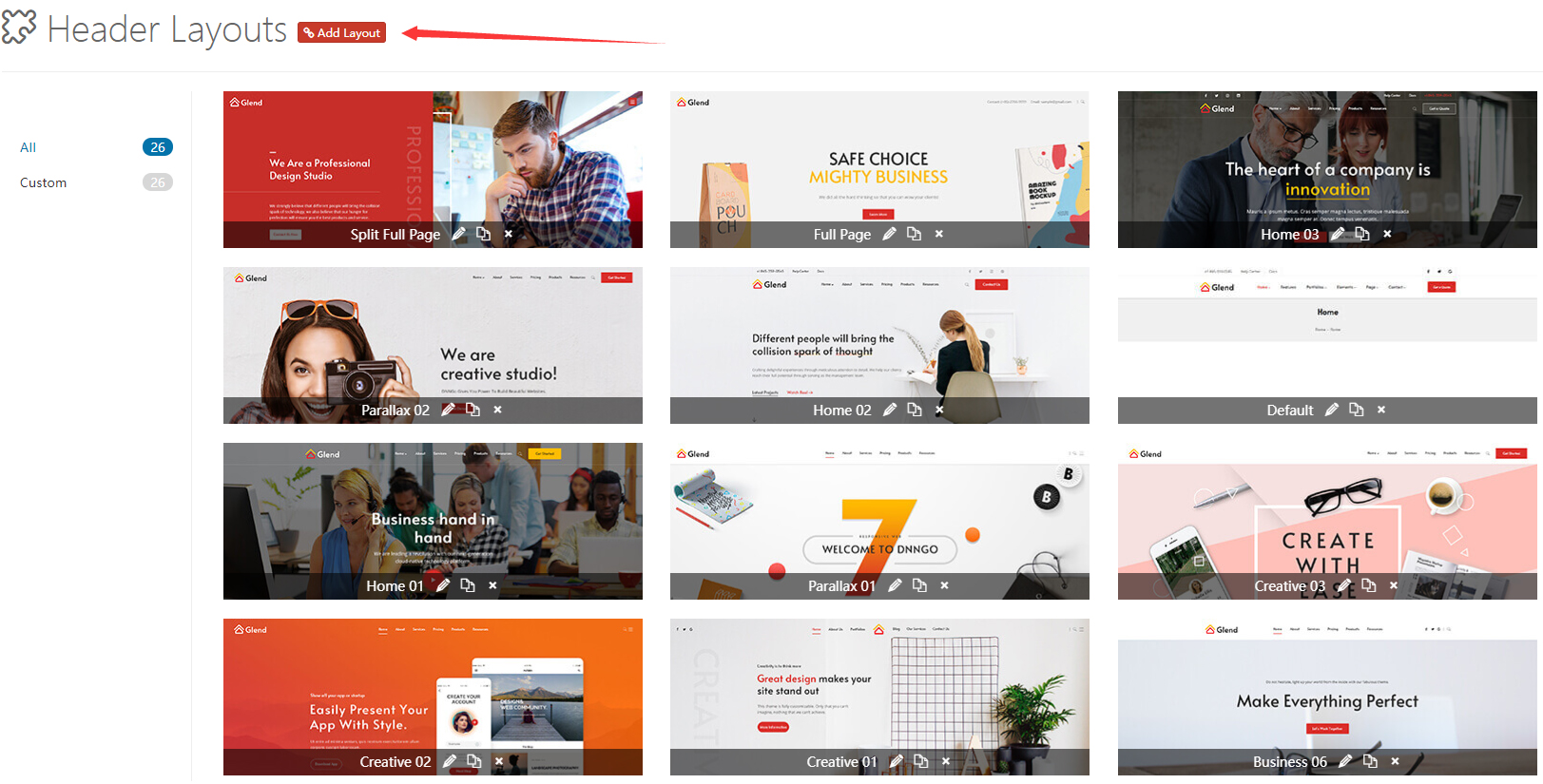
9 Grids Area
We divide the Header into 3 rows × 3 columns, forming a nine-grid. You can add controls to each cell.
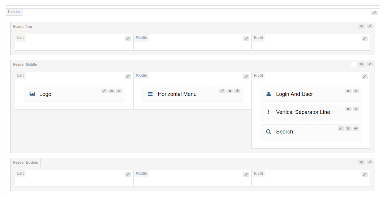
The three rows correspond to three horizontal areas of the Header (by default, only the Middle row is enabled):
| Row | Description | Default State |
|---|---|---|
| Top | Usually holds info bars such as contact details and social icons | Hidden (click the eye icon to enable) |
| Middle | The main navigation area; Logo, menu, search, etc. are usually placed here | Enabled |
| Bottom | Usually holds secondary navigation, decorative bars, etc. | Hidden (click the eye icon to enable) |
Within each row there are again three columns — Left / Center / Right.
Common layout ideas
- Logo on the left + navigation centered: Logo in Middle-Left, navigation in Middle-Center.
- Logo centered + navigation on both sides: Logo in Middle-Center, main navigation in Middle-Left, secondary menu in Middle-Right.
- Top info bar + main navigation: Contact info in Top-Left, Logo in Middle-Center, button in Middle-Right, main navigation in Middle-Center.
Header Settings
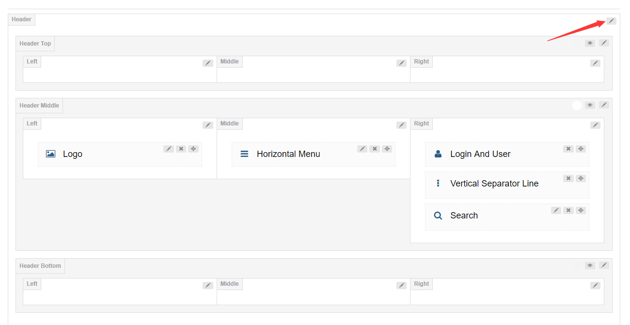
Click the edit icon to enter the Header's overall settings.
Header Position
Sets whether the Header floats over the Banner or page title. You can choose floating (float and overlay) or regular positioning.
Sticky Header
When enabled, the Header stays fixed at the top of the browser as you scroll down the page.
Sticky Header Type
Sets the switch style of the sticky header (such as sticky for a smooth stick), which determines the animation effect on scroll.
Header (Top / Middle / Bottom) Settings
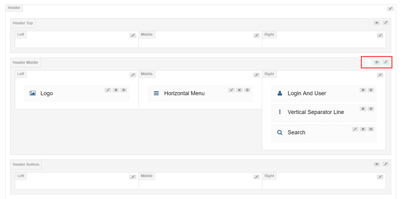
By default, the Top and Bottom rows are hidden. Click the eye icon to enable them; click the edit button to configure that area.
General
| Setting | Description |
|---|---|
| Row Height (px) | Sets the height of the row |
| Layout | Sets the width of the content area; can be full width or fixed width |
| Area Space (px) | Sets the spacing between the Left, Center, and Right columns |
| Distance Between Controls (px) | Sets the distance between controls within the same column |
Split Line Between Grids — Whether to show a divider line between each pair of grids.

Bottom Line — Whether to show a divider line at the bottom of the area.

Display Shadow — Whether to show a gray shadow at the bottom of the area.

Accent Color — Sets the accent color for the area, typically used for the color when a control is hovered or clicked. By default it follows the theme accent color variables (such as var(--accent-color), var(--accent-color2)).

Extra class name — Attaches a custom CSS class to the area.
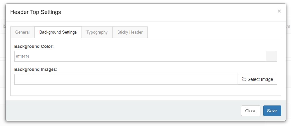
Background Settings
Set a background color or background image for the area.
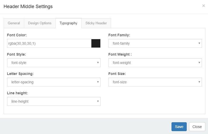
Typography
Set the font size, color, font family, and other text styling for the area.
Sticky Header (per-area)
Configure the area's behavior individually when it is in the sticky header state.
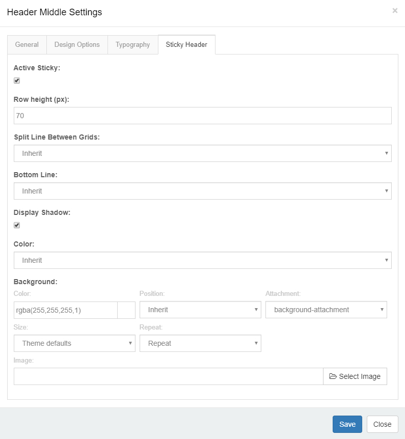
| Setting | Description |
|---|---|
| Hide on Sticky | When enabled, the area is not displayed when scrolling switches to the sticky header |
| Sticky Color | The foreground color of the area in the sticky state (e.g. dark / light) |
| Sticky Background Color | The background color of the area in the sticky state |
| Sticky Height (px) | The height of the area in the sticky state (usually smaller than the normal state, e.g. 64px) |
| Sticky Shadow | Whether to display a shadow in the sticky state |
Why configure it separately
In the normal state, a Header might use a dark background with white text (overlaying the Banner); after scrolling and switching to the sticky header, it typically changes to a light background with dark text to stay readable. With per-area Sticky settings, the same Header can present completely different visual styles in the two states.
Header Column Settings
General
| Setting | Description |
|---|---|
| Column width | Sets the width of the column |
| Arrangement | Sets the stacking direction of controls within the column: vertical or horizontal |
| Text Align | Sets the text alignment |
Background Settings
Set a background color or background image for the column.
Mobile Header Settings
Click the mobile icon to switch to the settings interface for the mobile Header layout. The mobile Header is also organized into Left / Center / Right areas, each holding controls and panes.
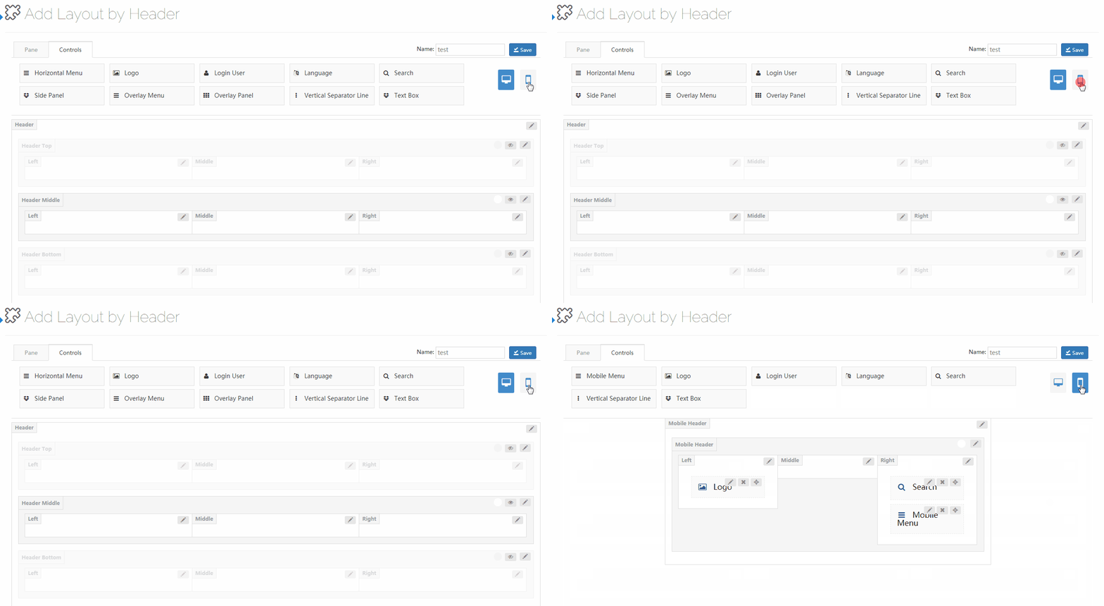
Controls
Controls are pre-built functional modules that can be dragged into any area of the nine-grid for use.
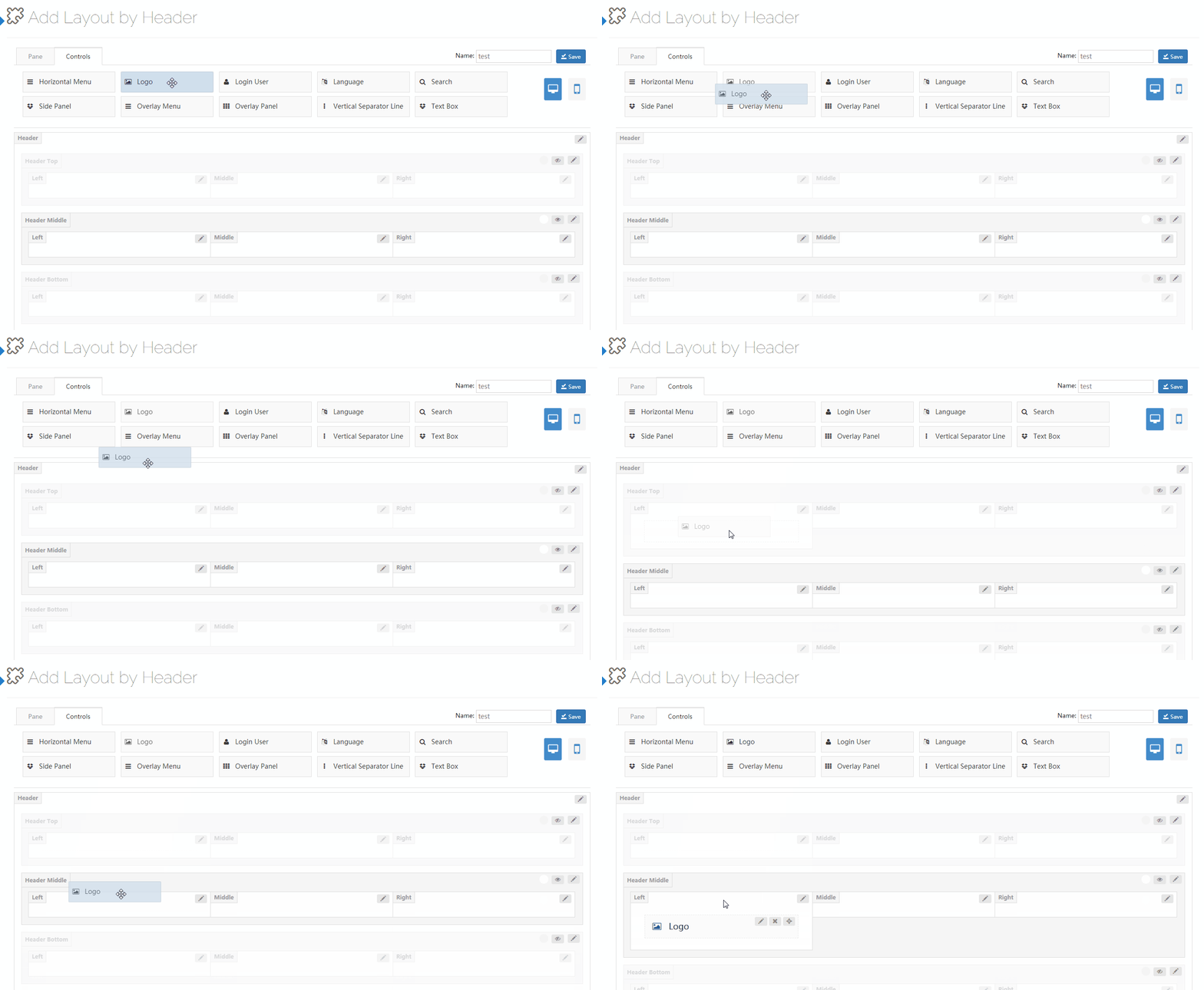
Each control has an edit button next to it; click it to enter its settings.
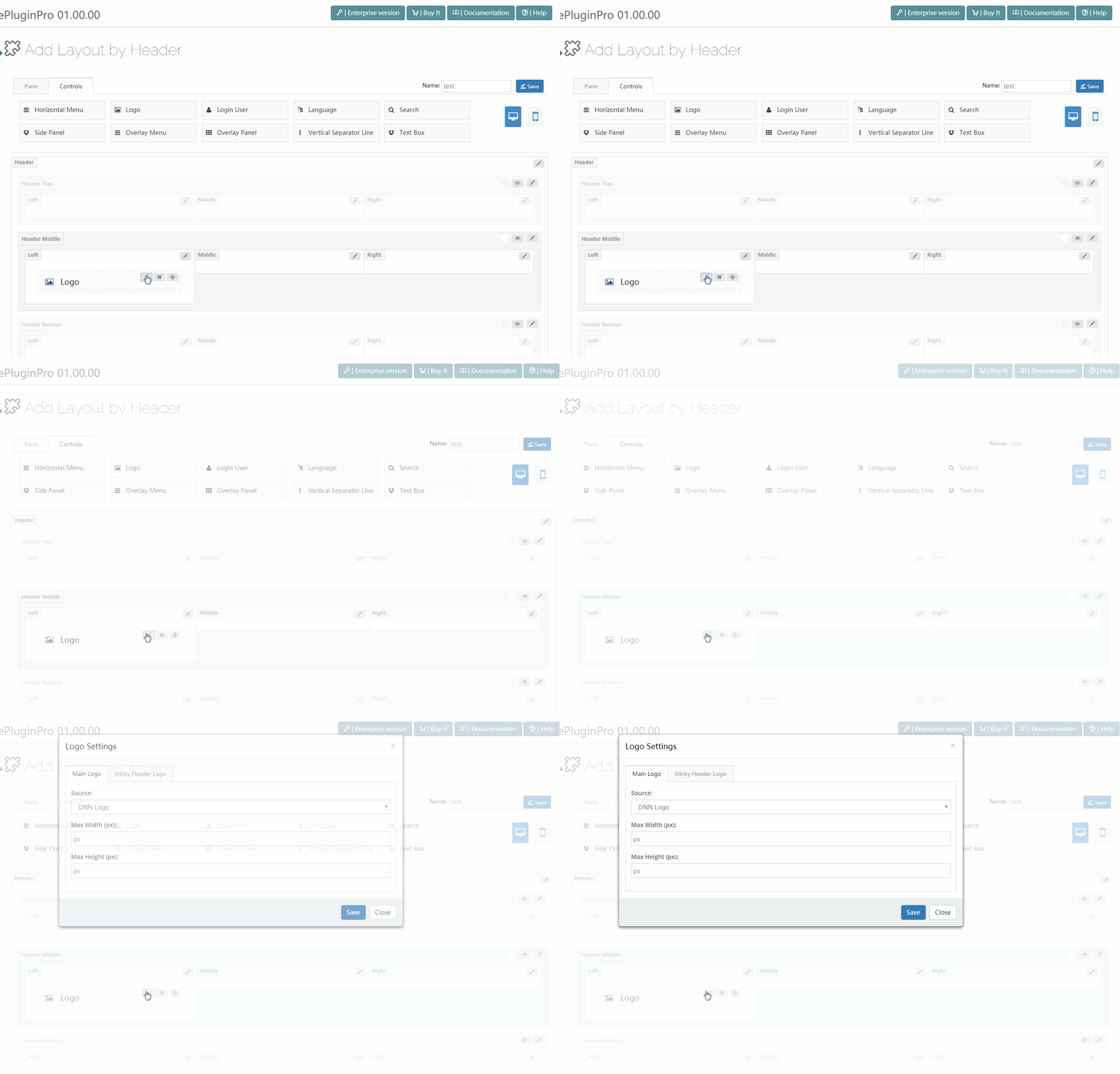
Available Controls List
The Controls tab in the left panel provides the following controls (some appear only in desktop or mobile mode). The detailed settings of commonly used controls are introduced one by one below.
Menu-type
| Control | Description | Available On |
|---|---|---|
| Horizontal Menu | The site's main navigation menu, supports Mega Menu effects | Desktop |
| Mobile Menu | A mobile hamburger menu; tap to expand a side navigation | Mobile |
| Side Panel | A panel that slides out from the side on button click; can hold menu/search, etc. | Desktop |
| Overlay Menu | A full-screen overlay menu; on click the menu fills the entire screen | Desktop |
| Overlay Panel | A full-screen overlay panel with effects | Desktop |
| Menu 3D Popup | A popup menu with 3D animation | Desktop |
| Popup Menu / Popup Menu 2 / Popup Menu 3 | Three popup menu styles (used with Side Nav) | Desktop |
| Popup Search | A popup-style search used with Side Nav | Desktop |
Function-type
| Control | Description | Available On |
|---|---|---|
| Logo | Displays the site logo image | Desktop / Mobile |
| Login User | Login/registration entry and user information | Desktop |
| Language | Switcher for multilingual sites | Desktop |
| Search | A search box; supports inline or popup style | Desktop / Mobile |
| Google Translate | The Google website translation plugin | Desktop |
| Accessibility | WCAG accessibility features (contrast, font size, readable fonts, etc.) | Desktop |
General Elements
| Control | Description | Available On |
|---|---|---|
| Vertical Separator Line | Separates adjacent controls to enhance visual hierarchy | Desktop |
| Text Box | Can hold any HTML content (social icons, link lists, buttons, custom text, etc.) | Desktop / Mobile |
| Pane | An independent content area (under the Pane tab, can hold DNN modules) | Desktop / Mobile |
Detailed settings for each control are described below.
Logo
The Logo control displays the site logo image in the Header.

The settings interface is split into Main Logo and Sticky Header Logo.
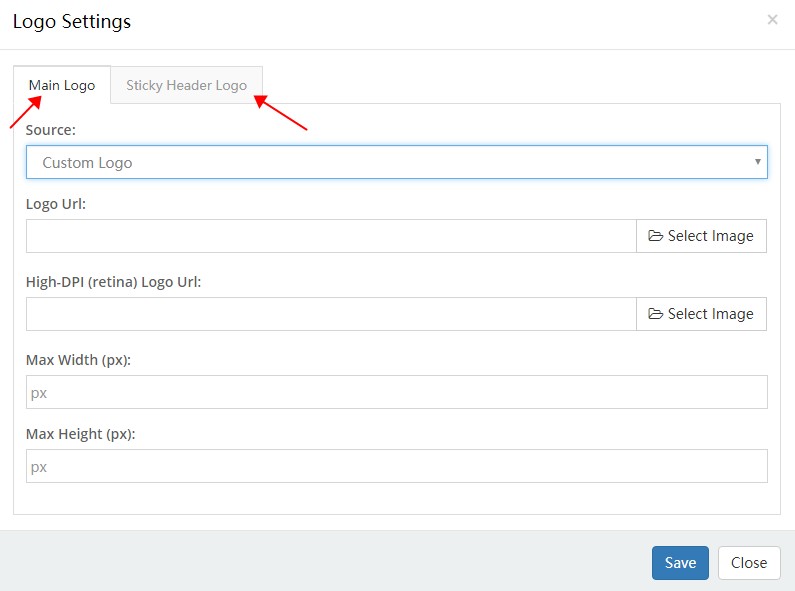
Main Logo
| Setting | Description |
|---|---|
| Source | The source of the logo image: DNN site logo or a custom logo. The DNN site logo is set in Admin > Site Settings |
| Logo URL | The URL of the custom logo image |
| High-DPI (retina) Logo URL | The logo image for high-DPI (Retina) screens; the file name must end with -2x, for example logo-d-2x.png |
| Max Width | The maximum width of the logo |
| Max Height | The maximum height of the logo |
Sticky Header Logo
Source — The source of the logo image in the sticky header state.
Main Logo vs. Sticky Header Logo
After enabling Sticky Header, the Header switches to the sticky state when the page scrolls. You can set different images for the two states (for example, a colored main logo and a white one when sticky) to suit different background colors.
Horizontal Menu
The Horizontal Menu control displays the site navigation menu in the Header.

The settings interface contains three parts: Main Menu, Flyout Menu, and Mega Menu.
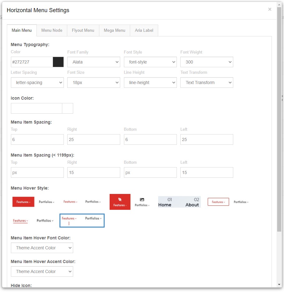
Main Menu
| Setting | Description |
|---|---|
| Menu Typography | The text styling (font size, color, font family, etc.) of the first-level menu |
| Menu Item Spacing | The top, bottom, left, and right spacing between menu items |

Menu Hover Style — The appearance style of a menu item on hover; 4 options are available.
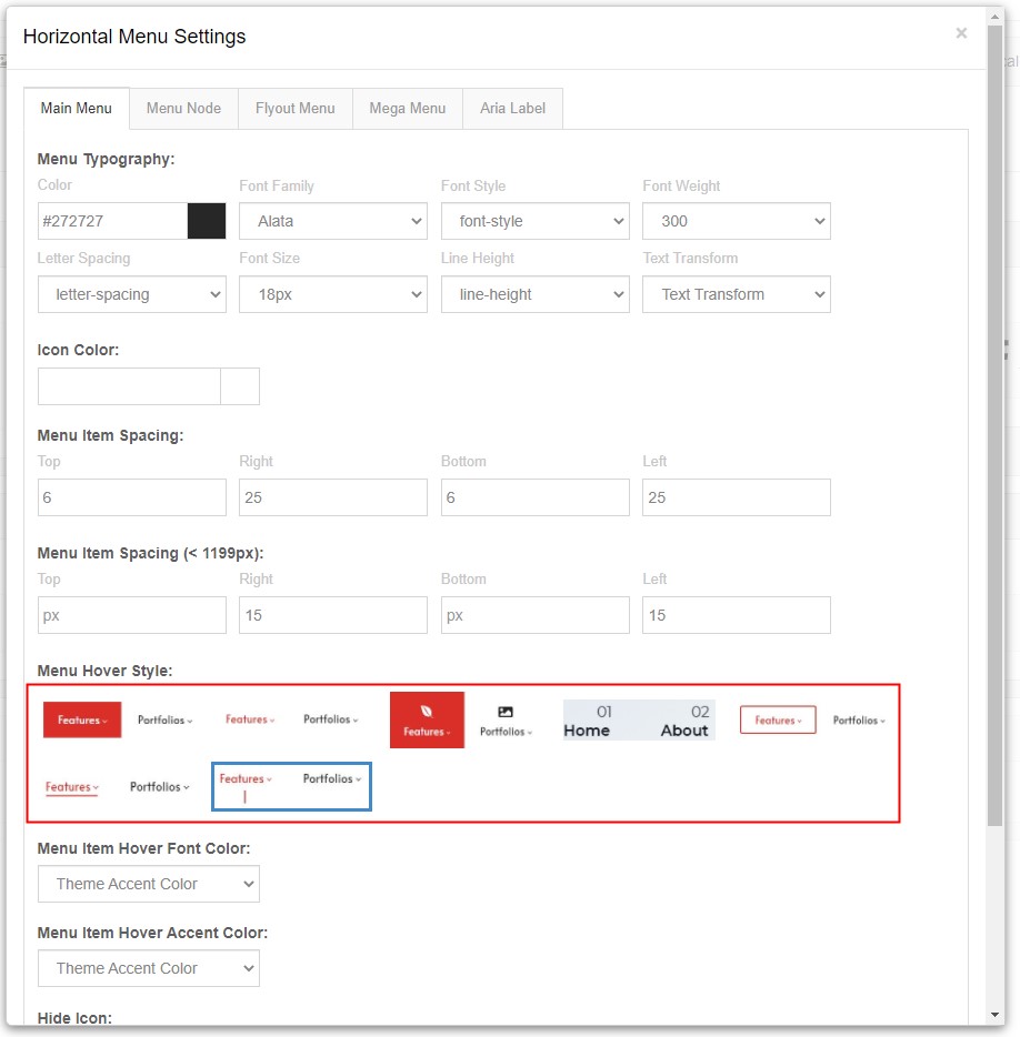
| Setting | Description |
|---|---|
| Menu Item Hover Font Color | The text color of a menu item on hover |
| Menu Item Hover Accent Color | The accent color of a menu item on hover |
| Menu Item Border-radius | The corner radius of the menu items |
Display Middle Logo — Whether to display a logo in the middle of the menu.

Flyout Menu
The flyout menu refers to the submenu that appears after a first-level menu item expands (popping out from the side on hover).
| Setting | Description |
|---|---|
| Menu Typography | The text styling of the flyout menu |
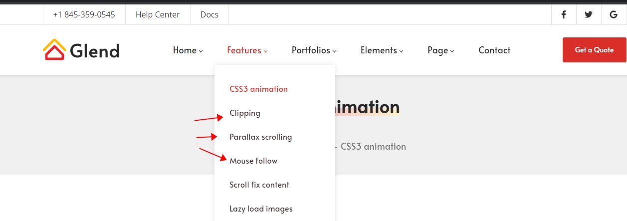
Display Shadow — Whether to display a shadow.
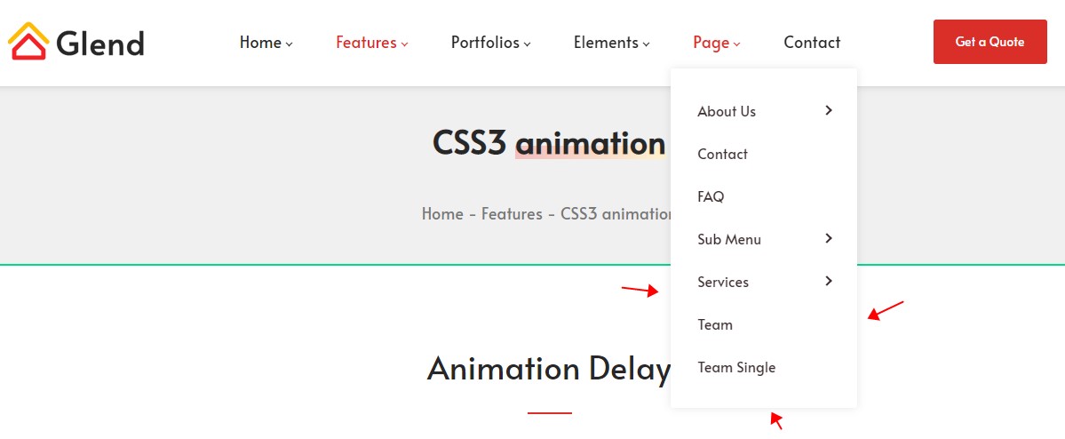
Background — The background of the submenu.
Mega Menu
Mega Menu is an enhanced dropdown menu that can display multi-column content within its expanded area (group titles + multiple groups of links), ideal for information-heavy navigation.
| Setting | Description |
|---|---|
| Menu Typography | The text styling of the Mega Menu |
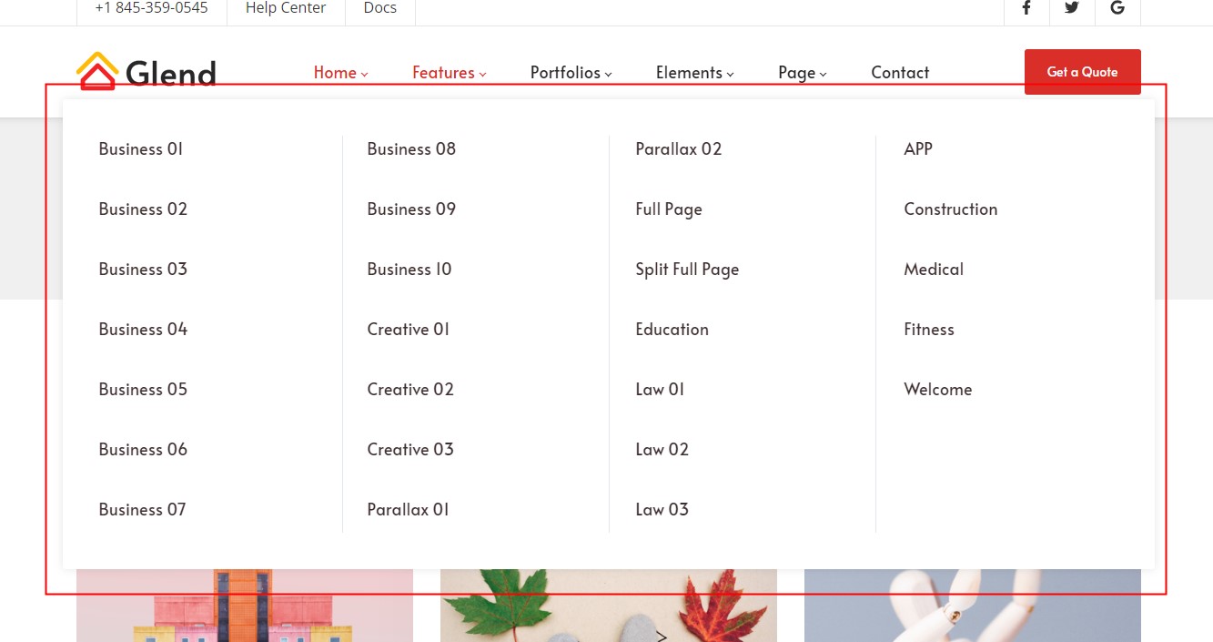
Menu Title Typography — The text styling of each group title within the Mega Menu.
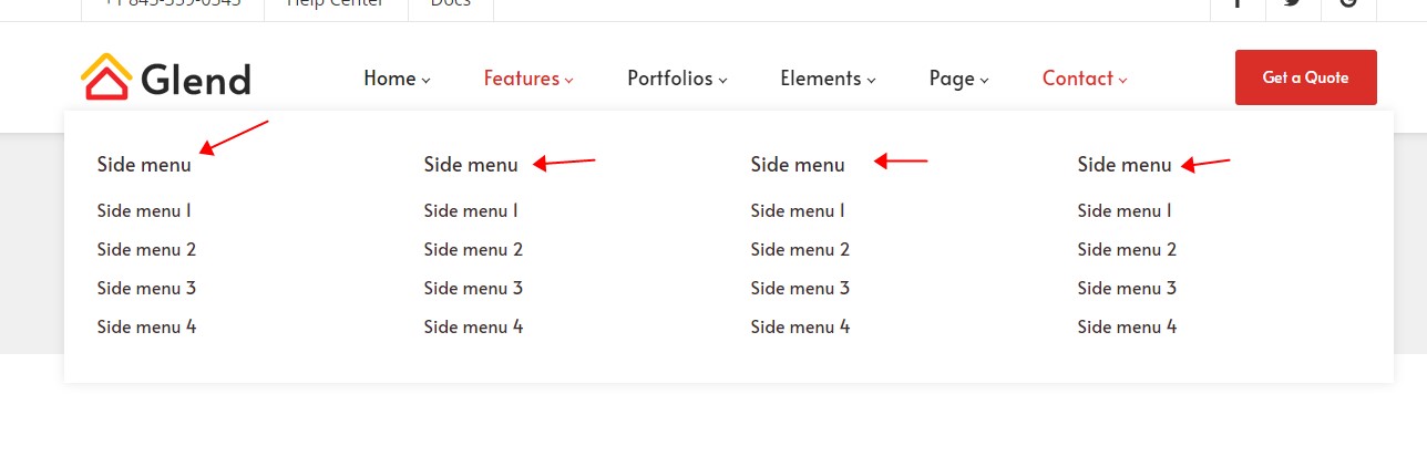
Display Shadow — Whether to display a shadow.
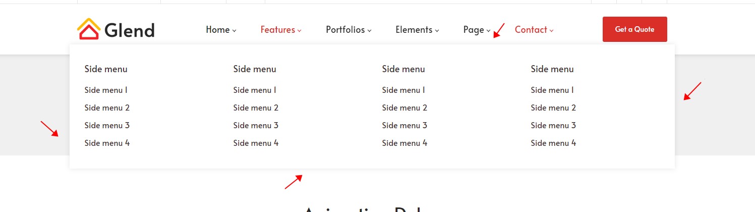
Line Color — The color of the vertical divider lines inside the Mega Menu.
Enabling Mega Menu
Mega Menu is an enhanced effect for top-level menu items. Go to Pages, click the corresponding top-level page's Edit Megamenu, and configure the groups and link content; once enabled, that menu item's dropdown becomes the Mega Menu style.
Login User
The Login User control displays login and registration links in the Header.

The text color of the login user is set in Header Settings > Typography.
Language
The Language control displays a language selector in the Header.

There are 7 display types available:
Display Name — The full display name of the language:
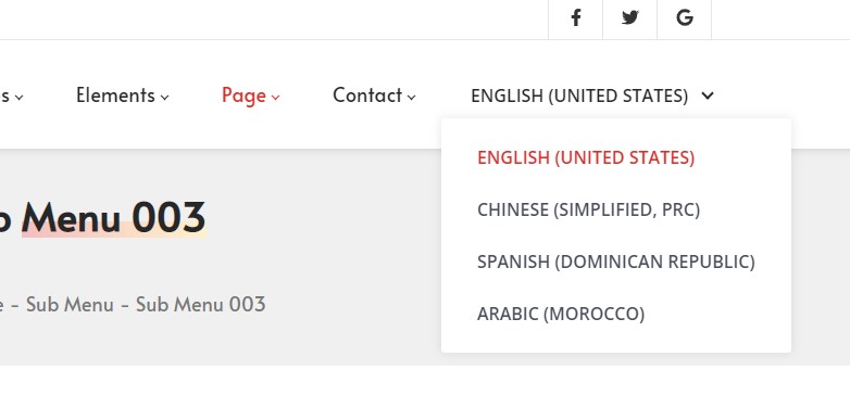
English Name — The English name of the language:
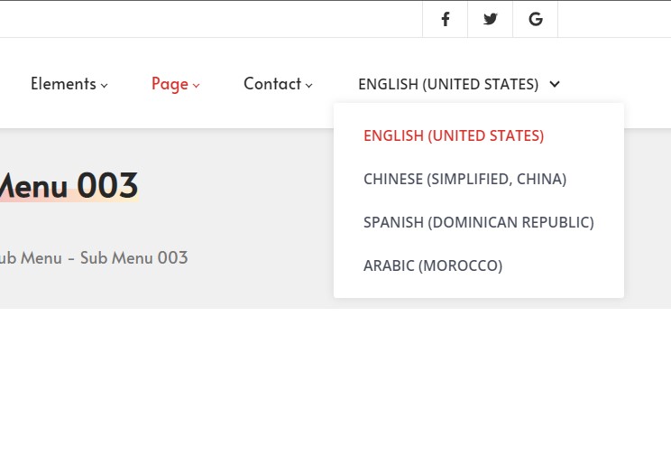
Name — The language name:
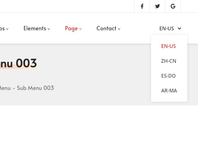
Native Name — The native (local) name of the language:
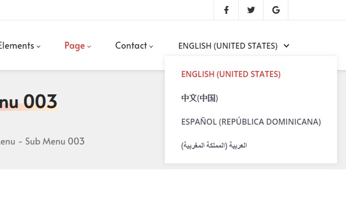
Two Letter — The two-letter code of the language (e.g. en, zh):
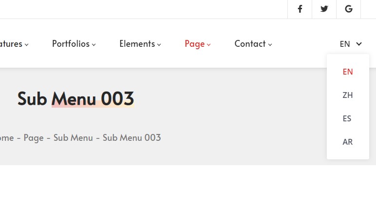
Three Letter — The three-letter code of the language (e.g. eng, zho):
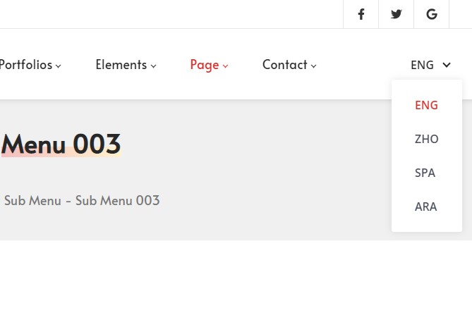
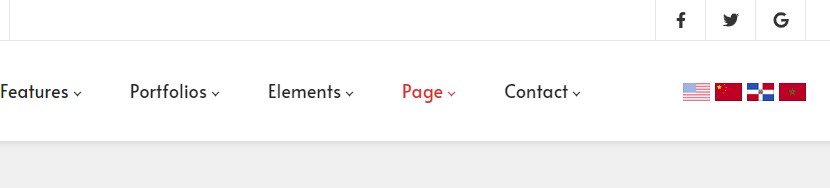
Flags — Displays the language as a flag icon:
Google Translate
The Google Translate control displays a language selector in the Header that visitors can use to translate the page text.

| Setting | Description |
|---|---|
| Default Language Text | The default language |
| Google Translate Language | Adds selectable language options to the control |
Not available in edit mode
This control is not available in PageBuilder edit mode; it only takes effect in the live browsing state after the page is published.
Search
The Search control displays a search input box in the Header.
| Setting | Description |
|---|---|
| Placeholder | The default placeholder text of the search box |
| Style | The style of the search panel |
| Accent Color | The accent color of the search control |
Vertical Separator Line
The Vertical Separator Line control displays a vertical divider in the Header.

The color of the divider line is set in Header Settings > Typography.
Text Box
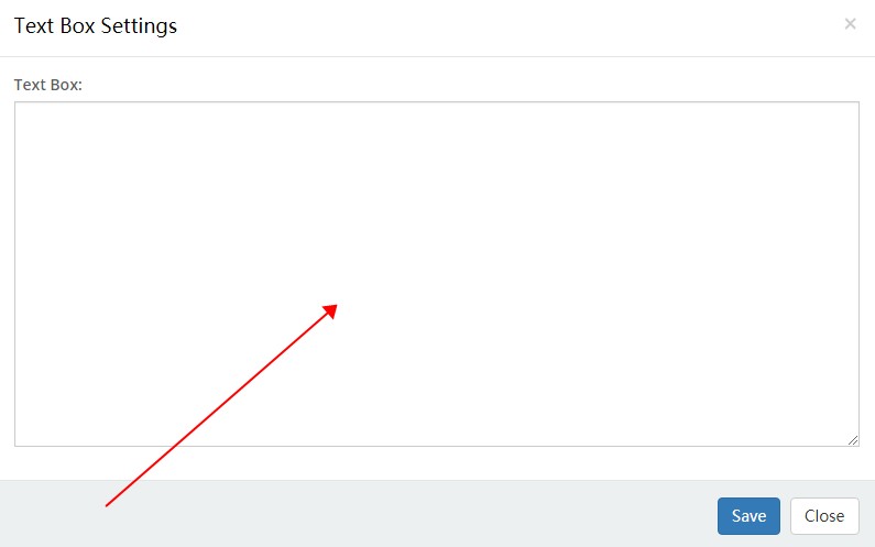
The Text Box control lets you enter text or HTML code.

Text Box — The code editing area.
Text Box is more than plain text
A Text Box can hold any HTML, not just text. For example, in the official Welcome layout, the social icons on the left, the "Help Center / Docs / email" link list on the right, and the "Get a Quote" button are all implemented by placing the corresponding HTML inside a Text Box.
Mobile Menu
Mobile Menu is a control exclusive to the mobile Header.
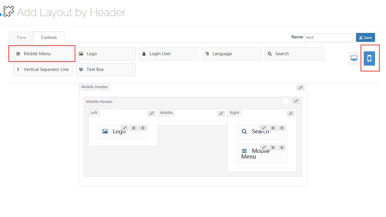
Tap the navigation icon of the mobile menu to pop up the menu.

| Setting | Description |
|---|---|
| Level 1 Menu Typography | The text styling of the first-level menu |
| Level 2 Menu Typography | The text styling of the second-level menu |
| Level 3 Menu Typography | The text styling of the third-level menu |
| Current Color | The text color of the current menu item |