
Mega Menu
On this settings page, you can choose the flyout menu display type for top-level menu items. Three types are available: Standard Menu, multi-column Mega Menu, and Custom Mega Menu, which lets you insert custom content.
Applies to
This setting applies to the menu items of top-level pages. Go to Pages and click the target top-level page's Setting → Edit Megamenu to reach this page.
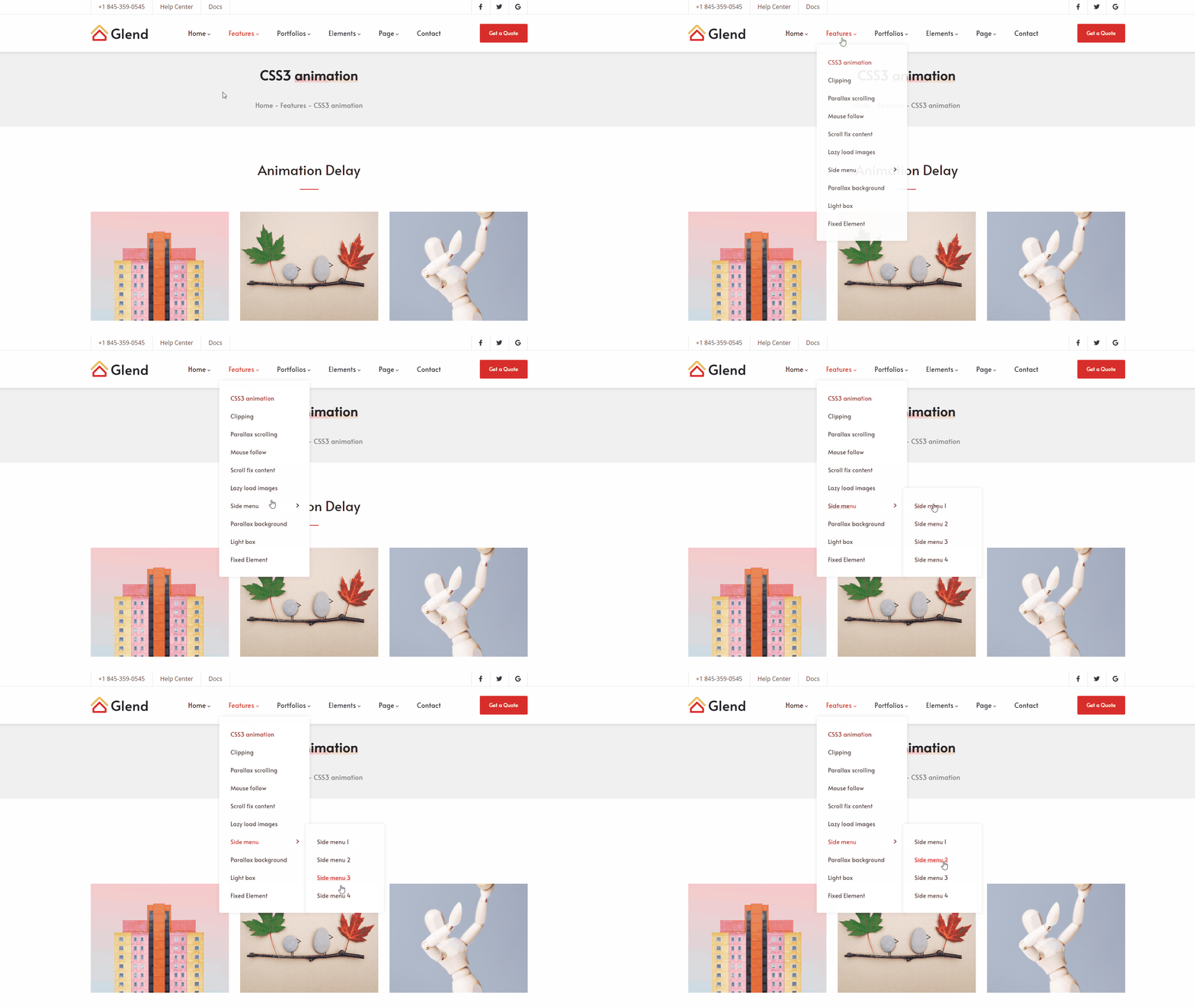
Standard Menu
The most common flyout menu form: a single-column submenu drops down from beneath the menu item on hover.
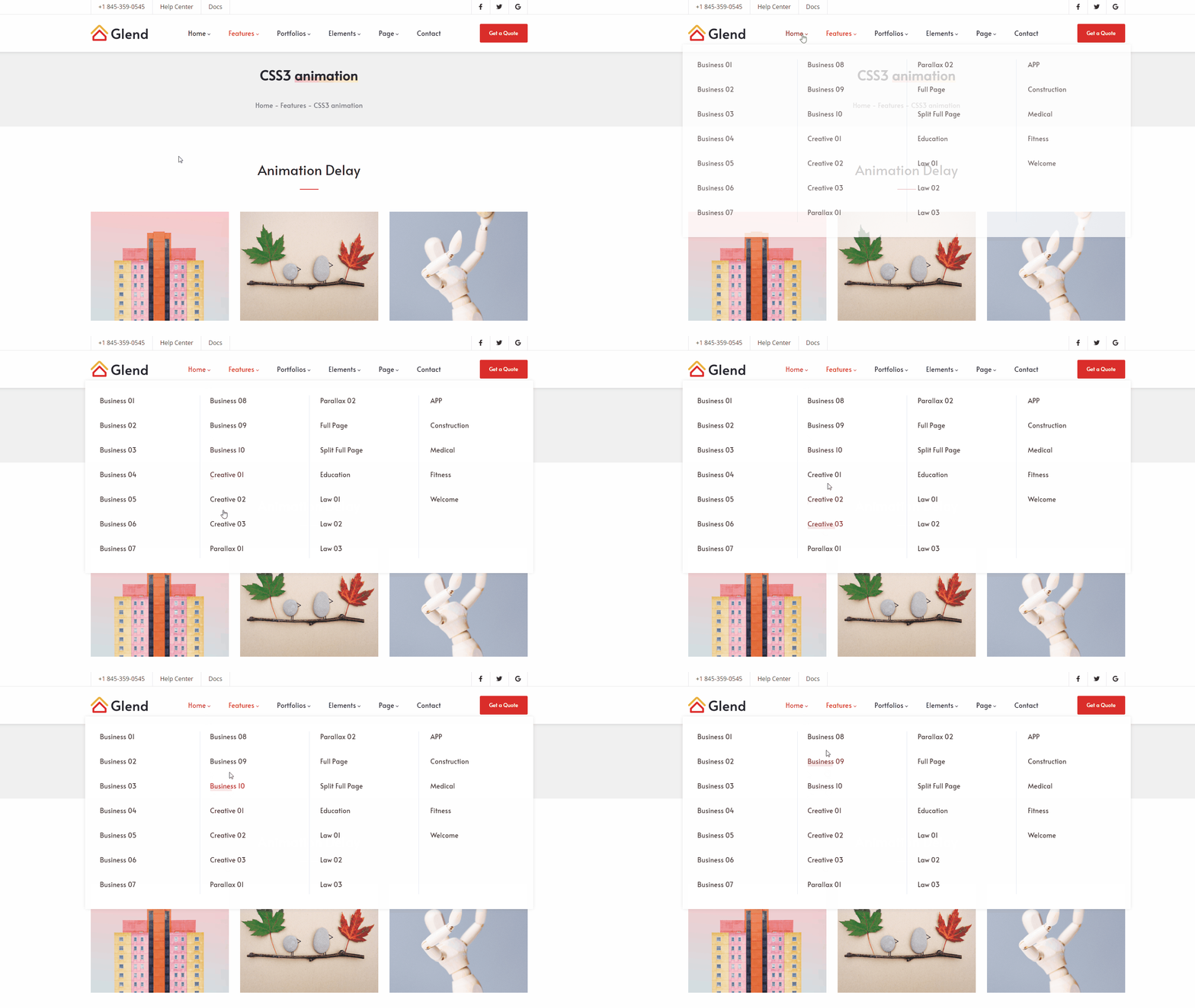
Mega Menu
Displays the submenu contents split into multiple columns, ideal when your navigation needs to show multiple groups at once.
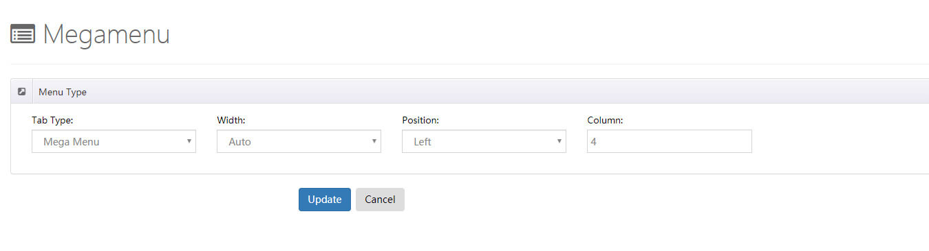
| Setting | Description |
|---|---|
| Width | The width of the submenu, in two modes (see below) |
| Position | The display position of the submenu |
| Column | The number of columns in the submenu |
Width has two modes:
- Auto — The submenu width matches the theme content area.
- Custom — Set the submenu width to a specific value.
Custom Mega Menu
Building on Mega Menu, you can freely insert custom content into the flyout panel — HTML code, third-party modules, modules from other pages, and so on — for maximum flexibility.
| Setting | Description |
|---|---|
| Width | The width of the submenu (Auto / Custom, same as Mega Menu) |
| Position | The display position of the flyout menu |
Pane
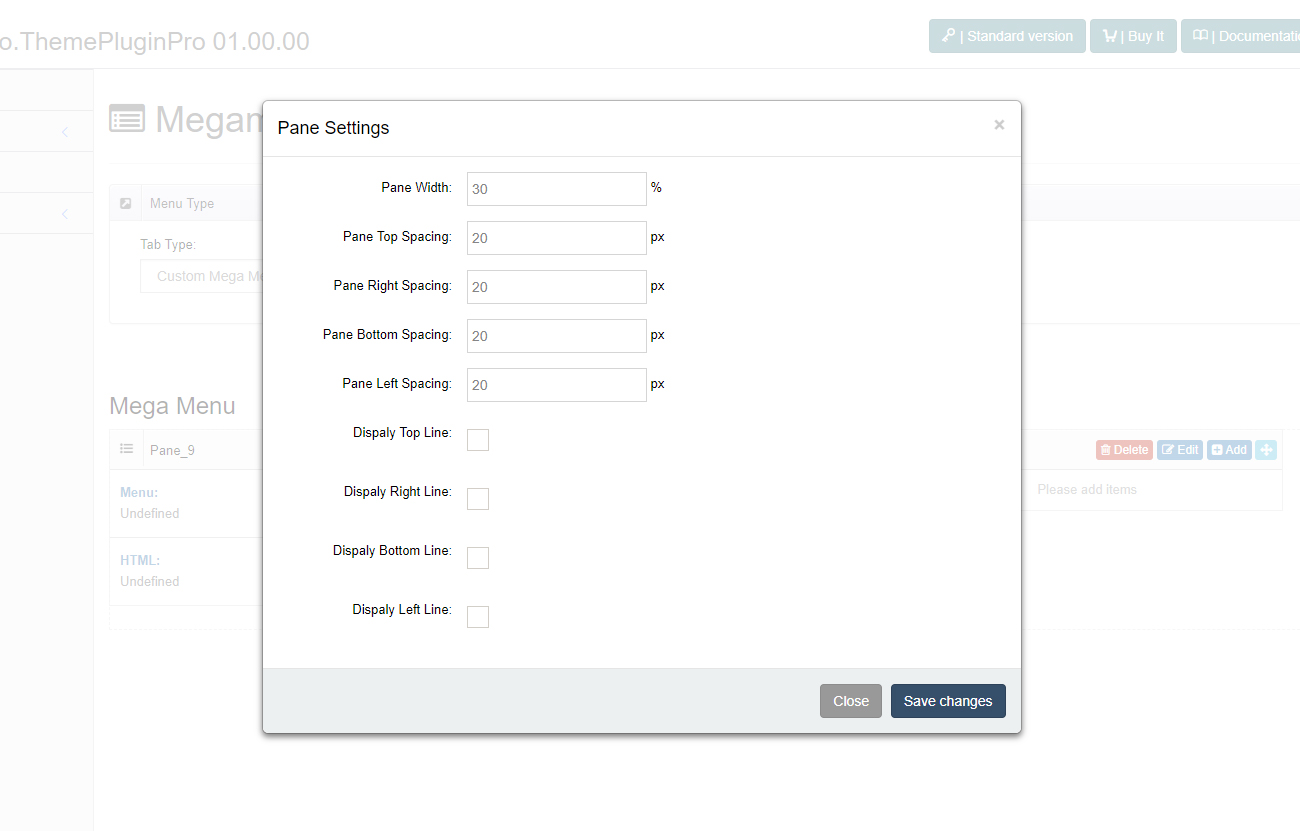
Custom Mega Menu organizes content through Panes. You can add multiple Panes in the control panel.
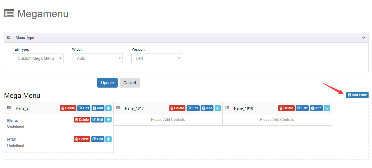
Each Pane can be individually adjusted for width, pane spacing, and borders.
Controls
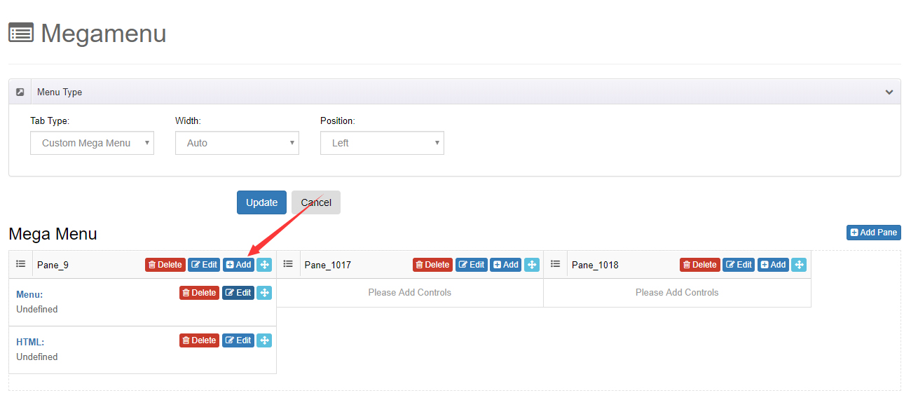
Within each Pane you can add the following controls to display content:
| Control | Description |
|---|---|
| Menu Control | Displays a specified menu and its submenus |
| HTML Control | Adds custom HTML code |
| Module Control | Calls a module from another page and displays it in the flyout menu |
Appearance Style
The visual styling of an expanded Mega Menu (text, titles, shadows, divider lines, etc.) is configured centrally in the Header layout. See Header Layouts — Mega Menu.